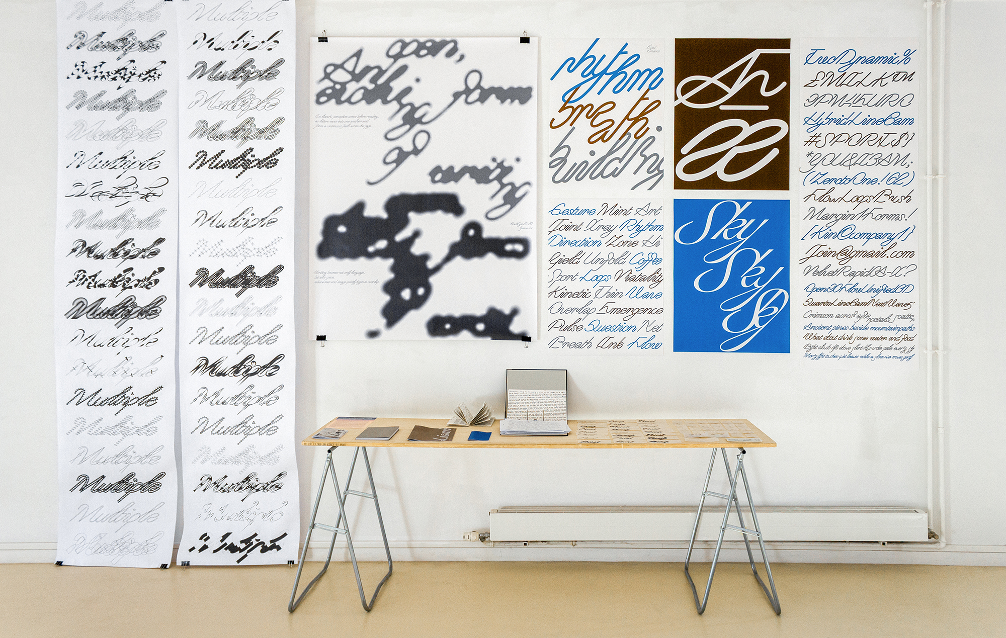
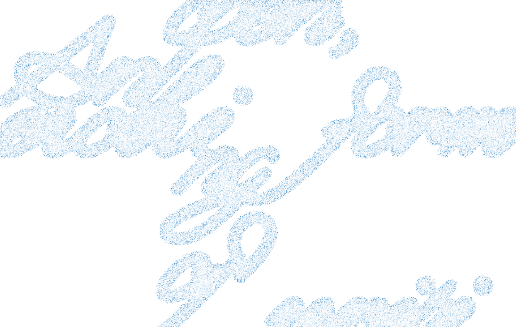
Liansh is an experimental typeface that treat Latin letters as continuous gestures with ligatures emerging naturally through shared strokes.
In conventional Latin typography, letters are usually treated as discrete units
placed side by side. Even when ligatures appear, they remain limited and
exceptional. Liansh challenges this structure by allowing strokes to extend
beyond the boundaries of individual characters. Connections emerge naturally
as writing flows, forming an interconnected visual system in which forms grow
from one another.
This approach draws from the structural thinking of Chinese cursive calligraphy,
where characters may compress, merge, and share gestures while maintaining
a continuous rhythm. Rather than imitating the visual appearance of Chinese
writing, Liansh adopts its conceptual principle: writing as a living continuum.
To explore different balances between readability and visual integration, the
typeface is organized into three levels. Each level expands the range and
density of generated ligatures. The first level maintains relatively stable letter
structures and ensures clear readability. The second introduces more frequent
shared strokes and ligature formations. The third pushes the system further,
allowing letters to merge more freely and creating a more fluid and interconnected
visual texture.
In addition to these levels, Liansh includes a contrast version that emphasizes
the calligraphic tension between thick and thin strokes, highlighting the dynamic
movement of writing. The system also experiments with vertical ligatures,
allowing connections to develop not only horizontally along the line of text but
also vertically, expanding the spatial possibilities of typographic composition.
Through shared strokes and extended ligatures, Liansh invites readers to
reconsider the boundaries between letters, words, and images. Writing becomes
not only a carrier of language, but also a field of visual movement where
perception and reading continuously interact.