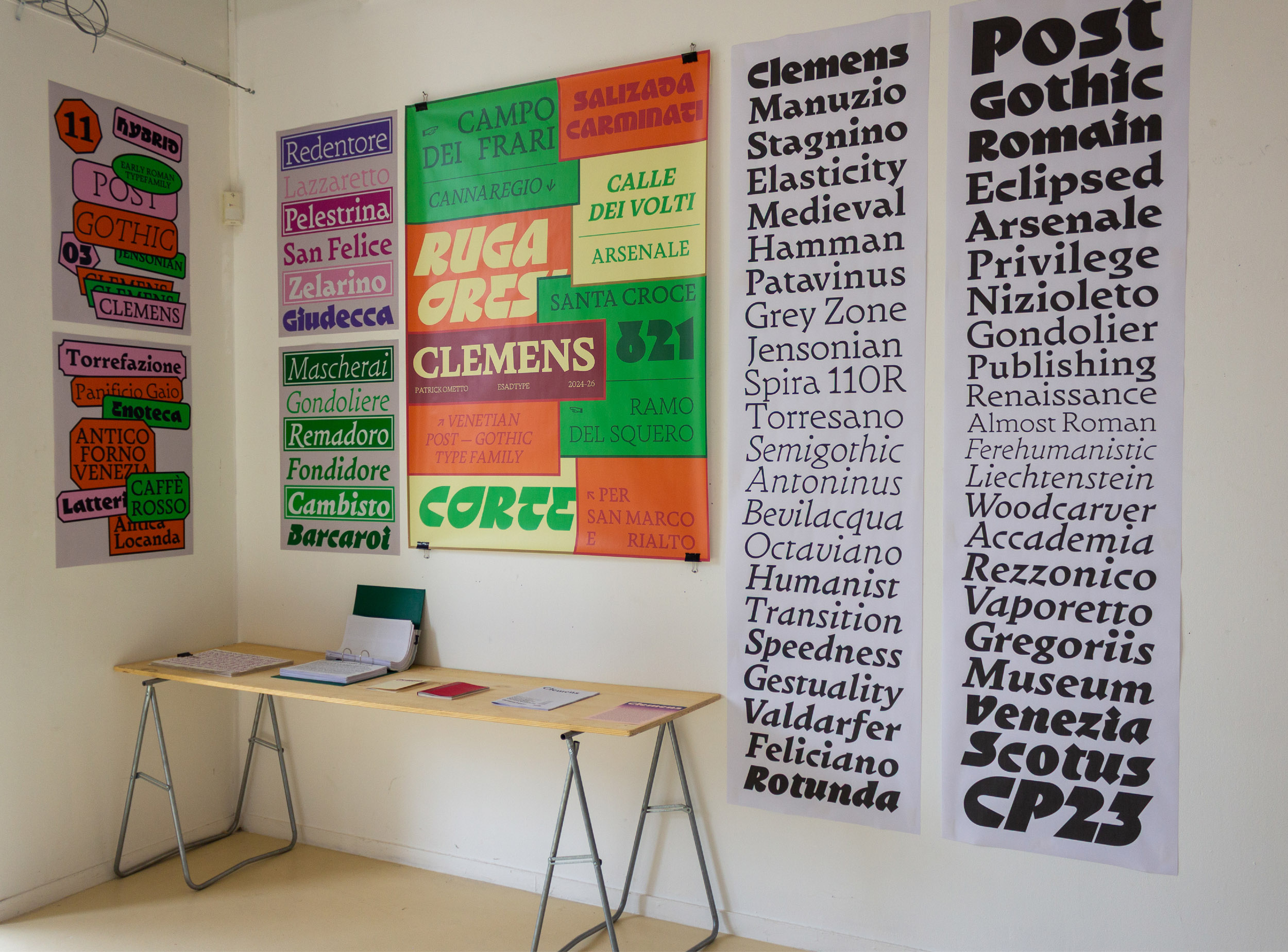
Clemens is a Venetian post-gothic type family occupying the transitional space between Rotunda and early humanist letterforms, rooted in fifteenth-century Venice, when typographic models were still in formation and their formal logics intersected before consolidating into distinct categories.
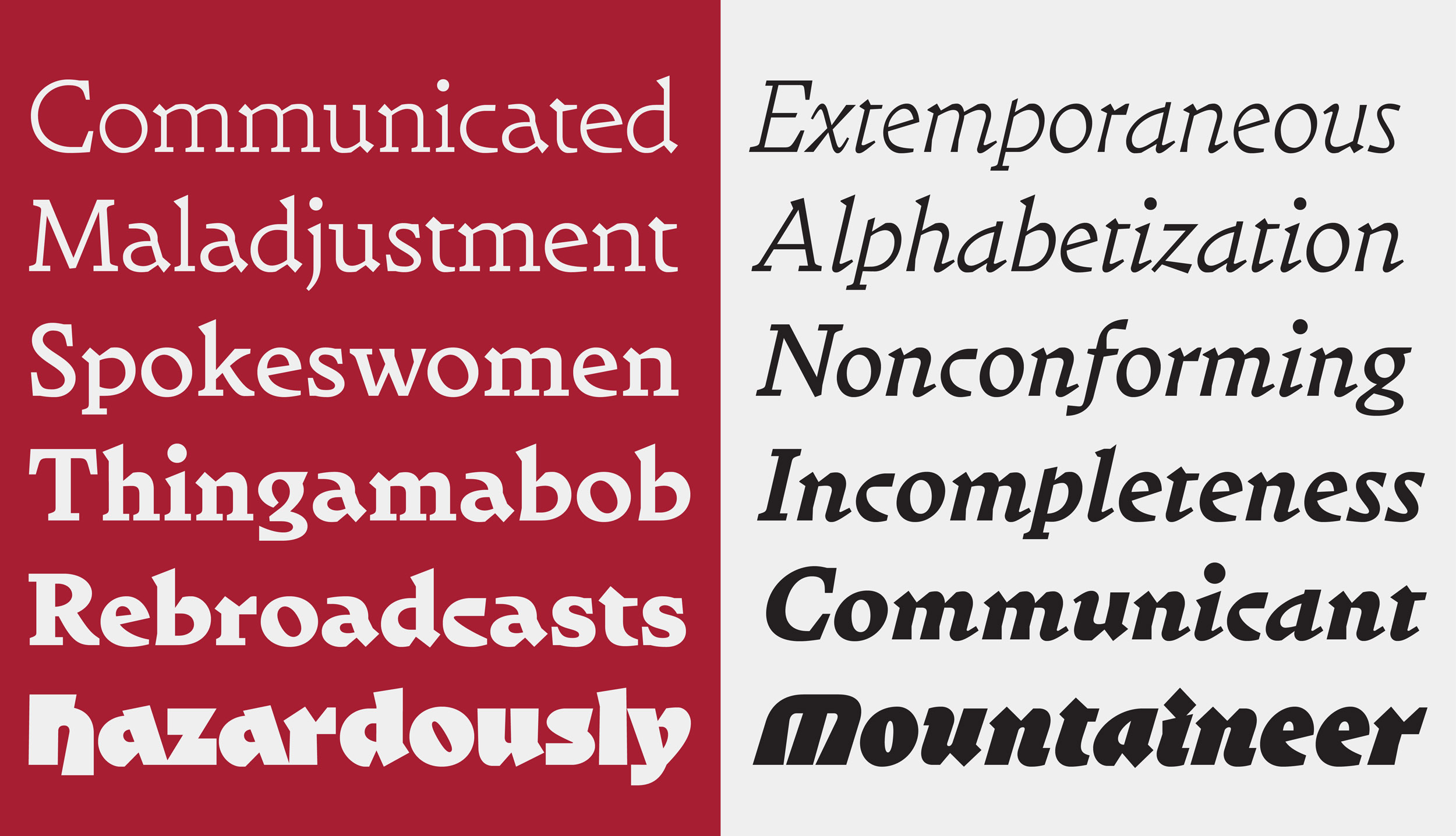
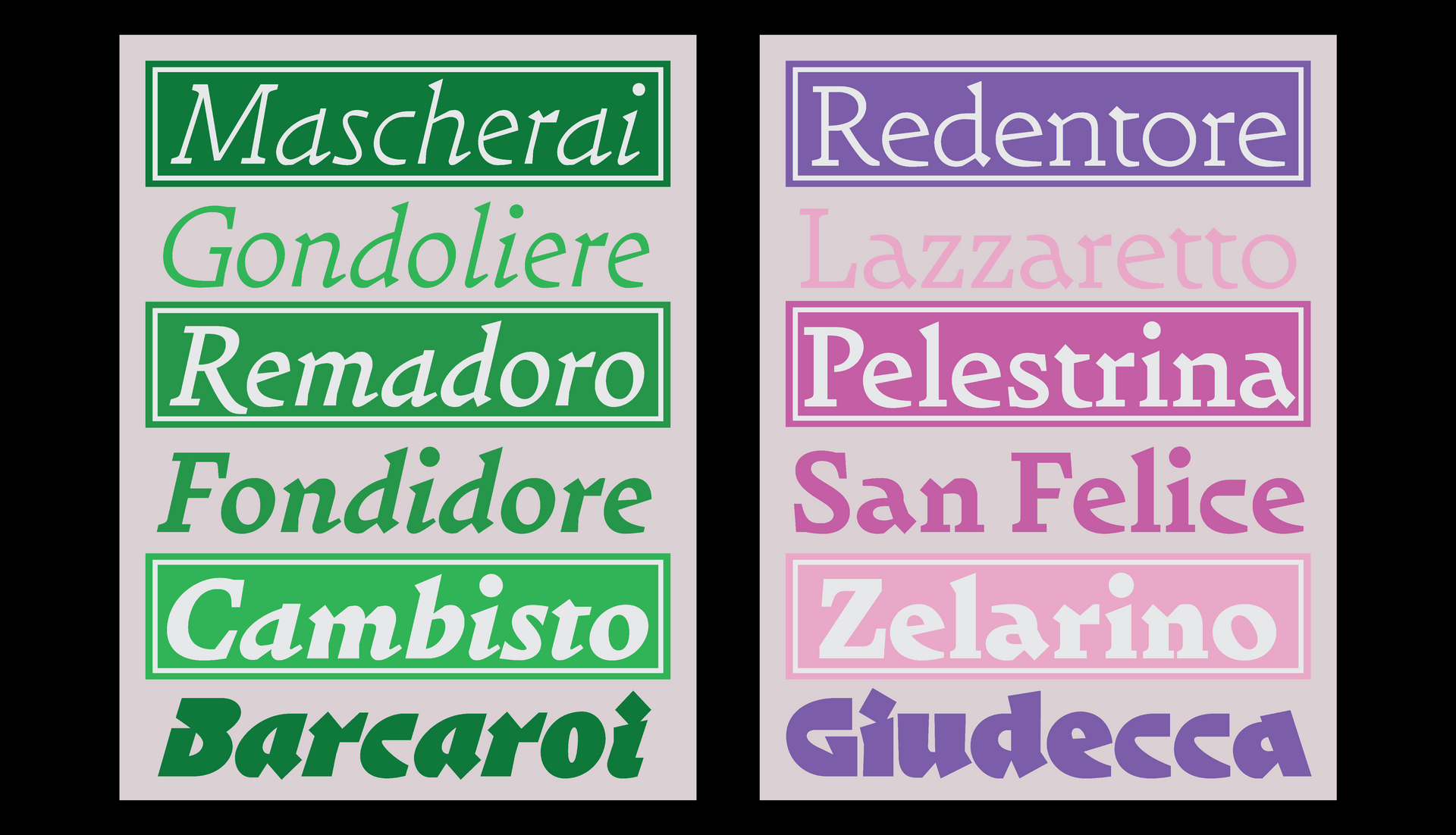
The family’s structure emerges from this condition of active tension. Vertical strokes retain the compact density and rhythmic compression of the rotunda tradition, producing a dark and cohesive typographic colour. Round forms open into broader counters and expanded proportions, drawing closer to emerging roman constructions. This opposition functions at a systemic level, defining spacing, weight distribution, and the overall texture of the text.
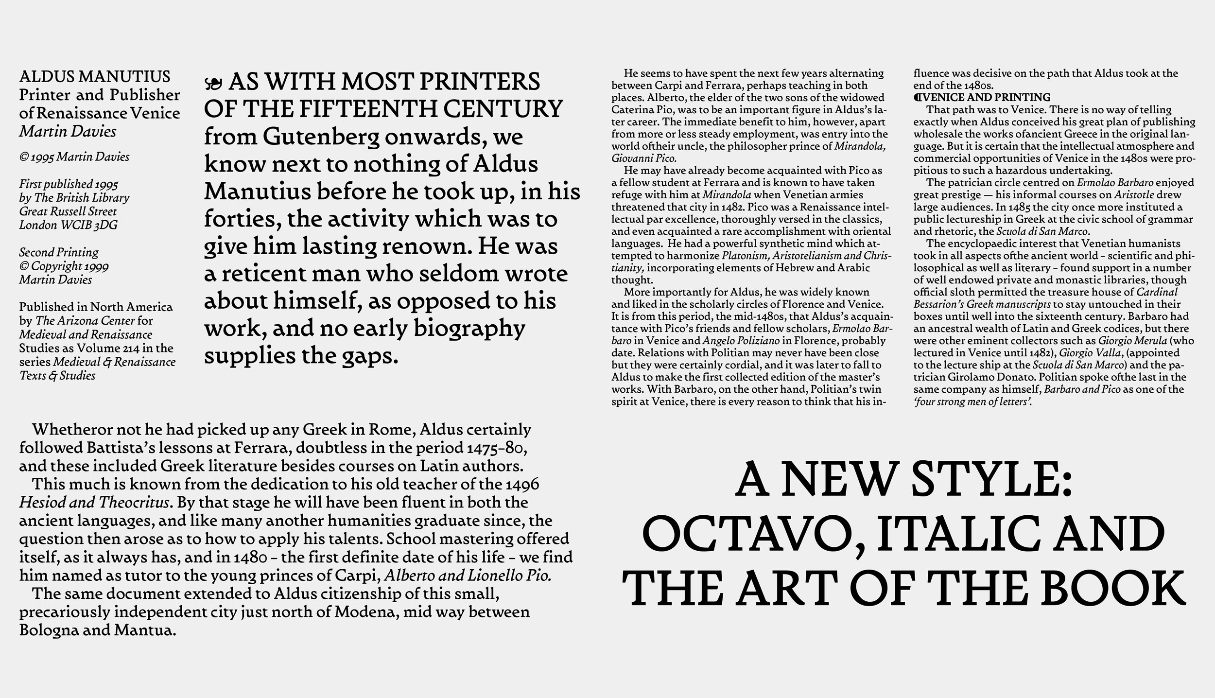
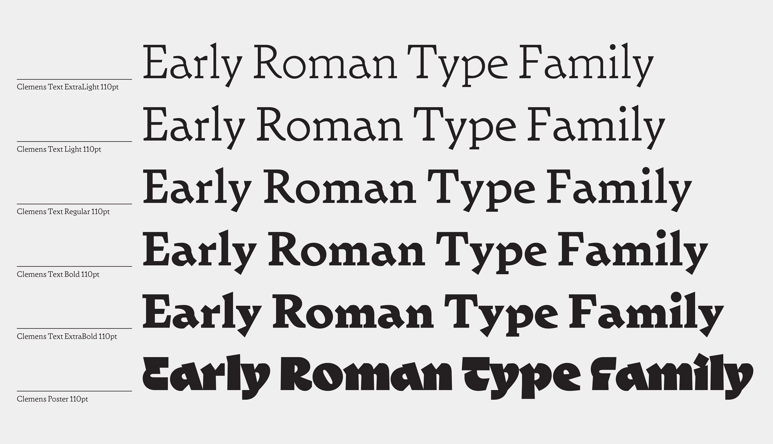
Conceived primarily for sizes between 8 and 12 pt, Clemens prioritises structural balance and reading continuity. Proportions are calibrated to sustain compactness at small sizes while preserving internal differentiation. As scale or weight increases, the constructive contrast becomes more legible: junctions gain articulation, curves tighten, and the opposition between vertical compression and expanded roundness intensifies progressively.
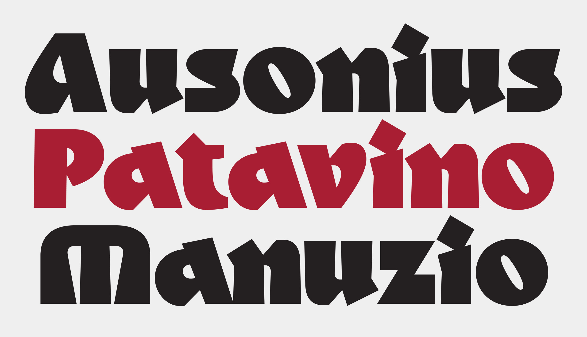
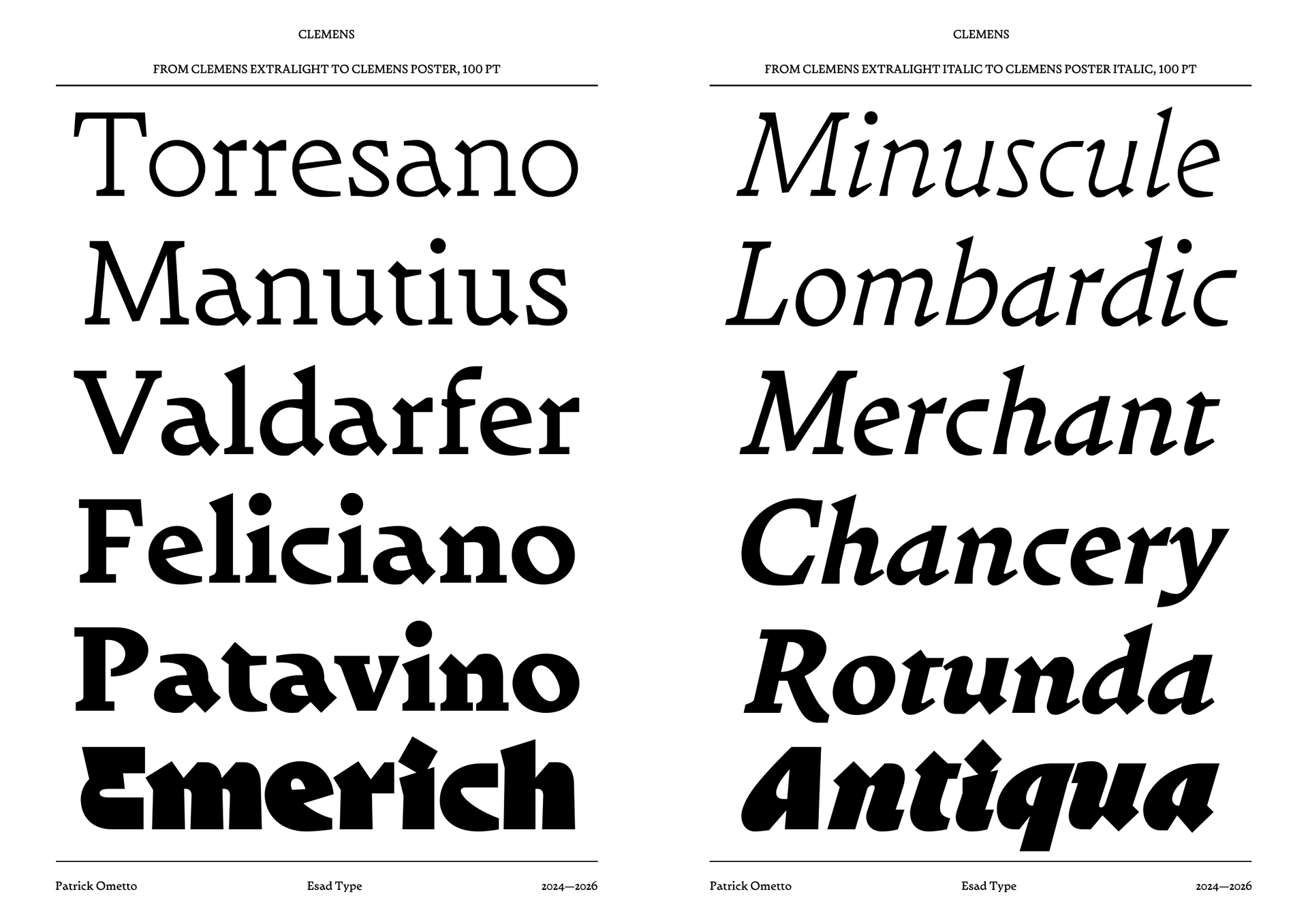
The Italic extends this investigation through controlled directionality, introducing movement within the same structural framework and negotiating between gothic weight and roman clarity without resolving into either pole. In the Poster and Poster Italic styles, intended for display use, the dual structure becomes explicit: contrast sharpens, forms grow more assertive, and the spatial tension between compact stems and open rounds defines a pronounced visual identity.
The family spans from ExtraLight to ExtraBold with corresponding Italics and dedicated Poster styles. The name refers to Clemente Patavino, among the earliest Italian printer active in Venice, situating the project within that formative moment when typographic models had yet to crystallise into stable categories.