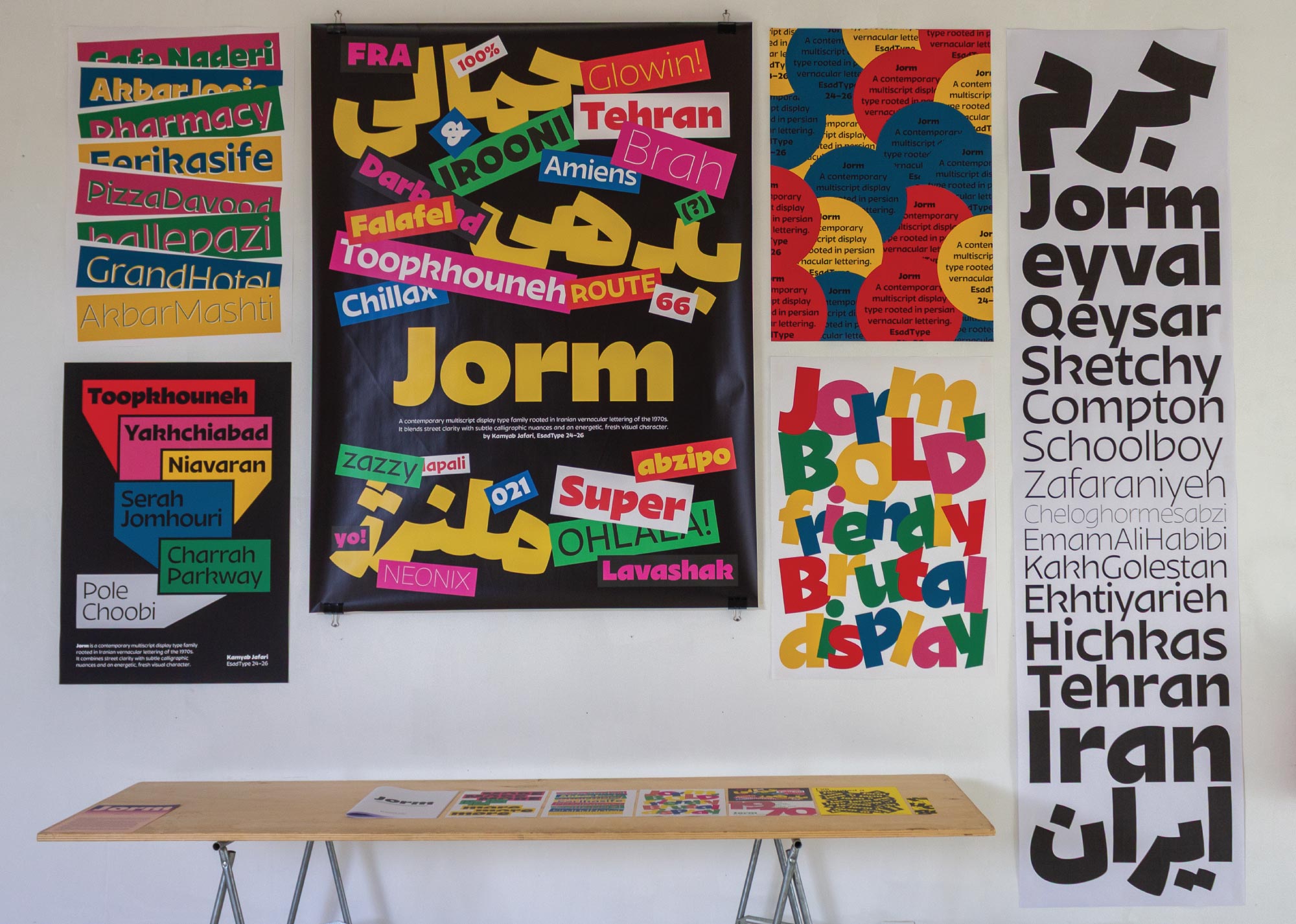
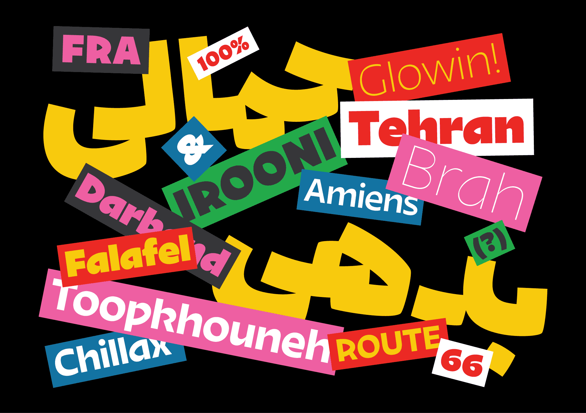
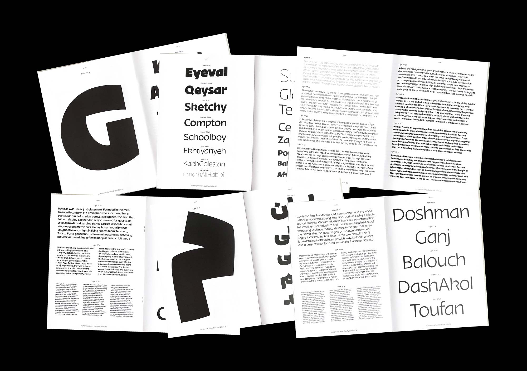
Around the 1970s, Iranian street culture produced a distinctive visual language: bold, hand-painted letters on shopfronts, cinema posters, and commercial signage. Shaped by speed, constraint, and local invention rather than typographic convention, these forms carried an expressive energy that formal type design had largely left untapped.
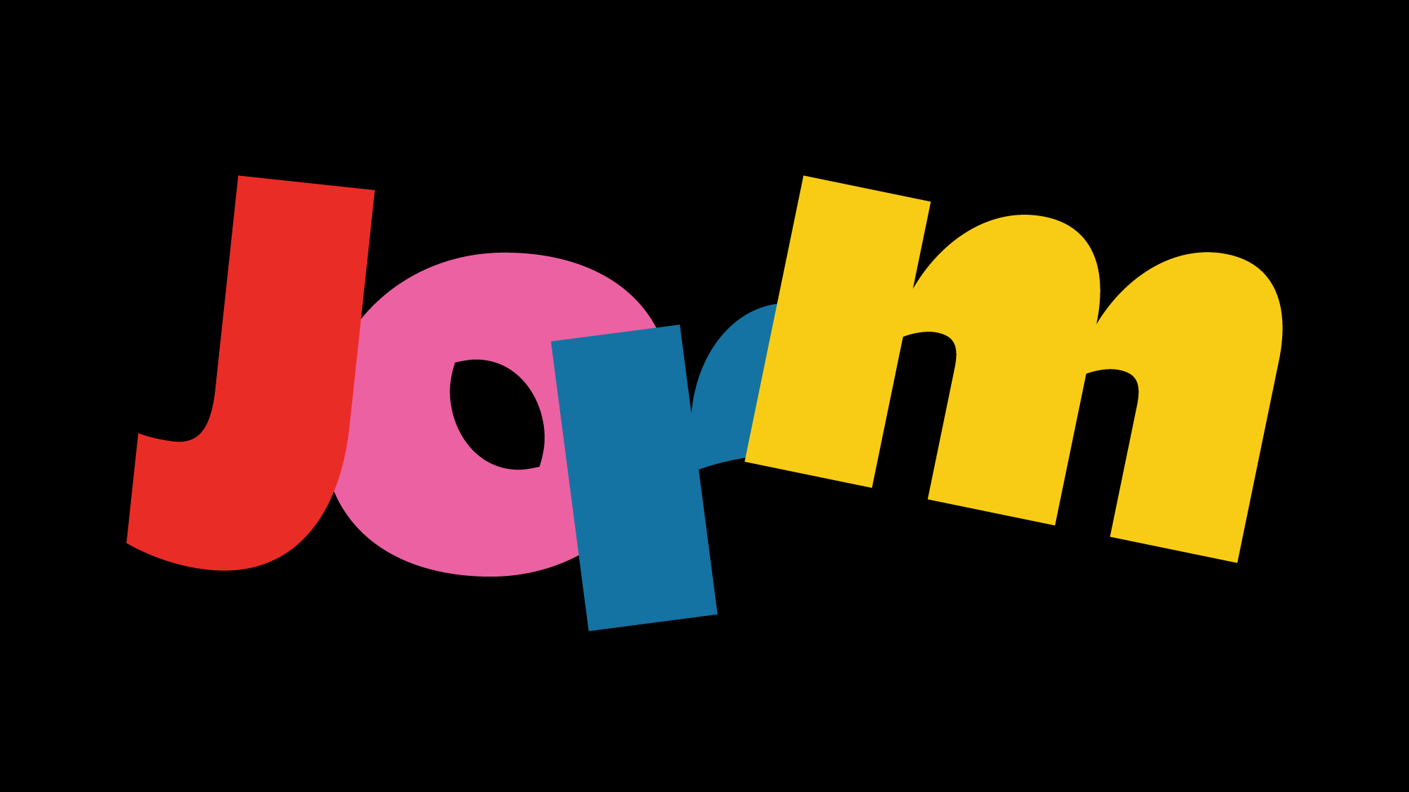
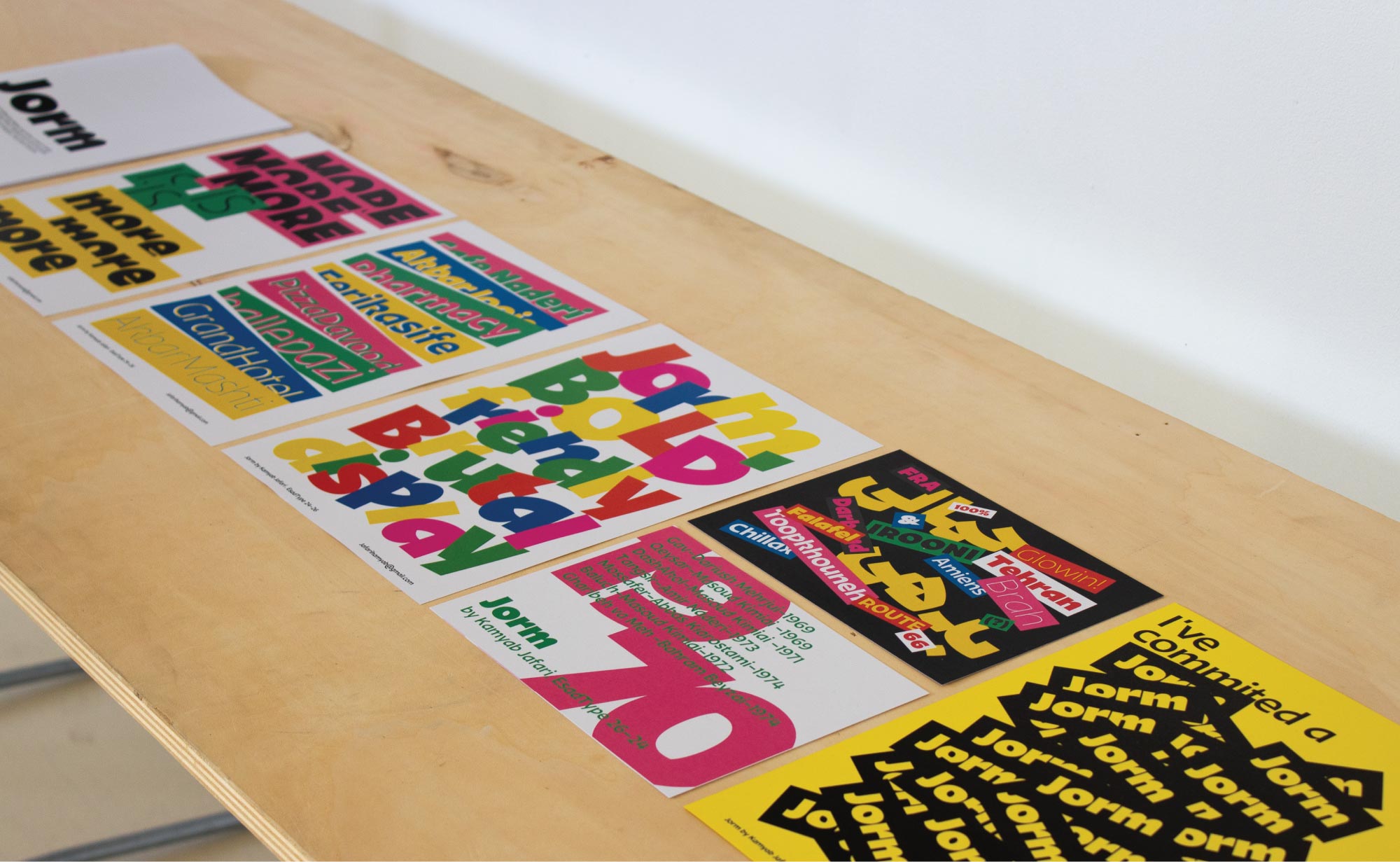
Jorm is a contemporary display type family developed from this vernacular tradition. Its construction draws on three guiding principles: invention, simplification, and broken balance. Rather than reproducing the surface of its sources, it extracts their underlying logic: the way strokes are decided under pressure, how balance is deliberately broken to fit a space, and how form gains strength when detail is reduced and the silhouette becomes dominant.
The Arabic and Persian components came first, grounded in observation and calligraphic experimentation at small scale, where constraint produces natural simplification. The Latin followed through a parallel process: working from the same rhythm and visual mindset, arriving at shared construction rather than borrowed shapes. The two scripts are connected through weight distribution, stroke behavior, and spatial tension, a dialogue of structure rather than imitation.
Jorm spans a range of weights from Hairline to Black. Toward the lighter end, the internal geometry of the letters becomes fully visible. In the heavier cuts, the forms take on the blunt, immediate presence of the signs that first inspired them.