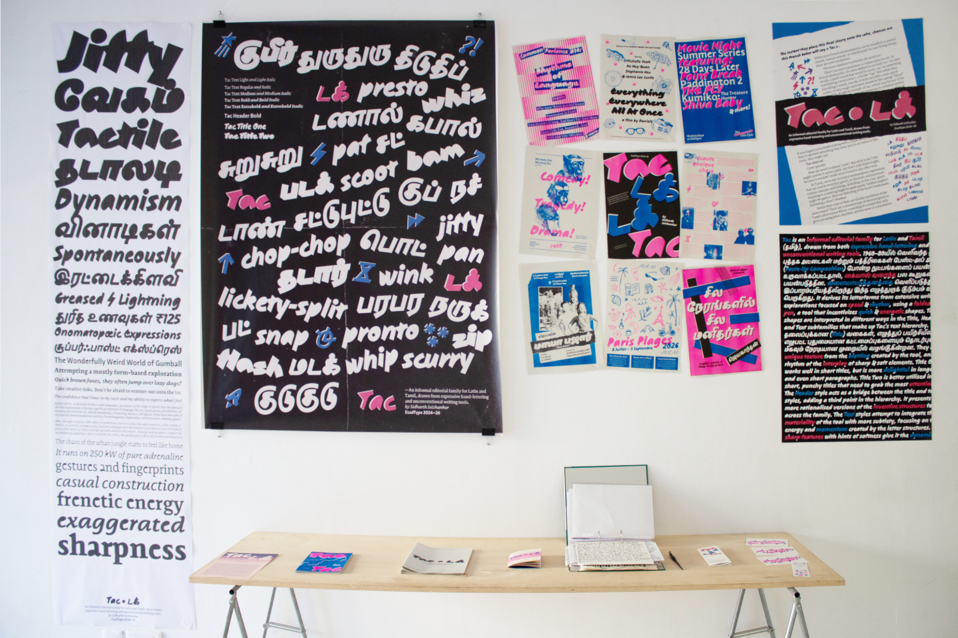
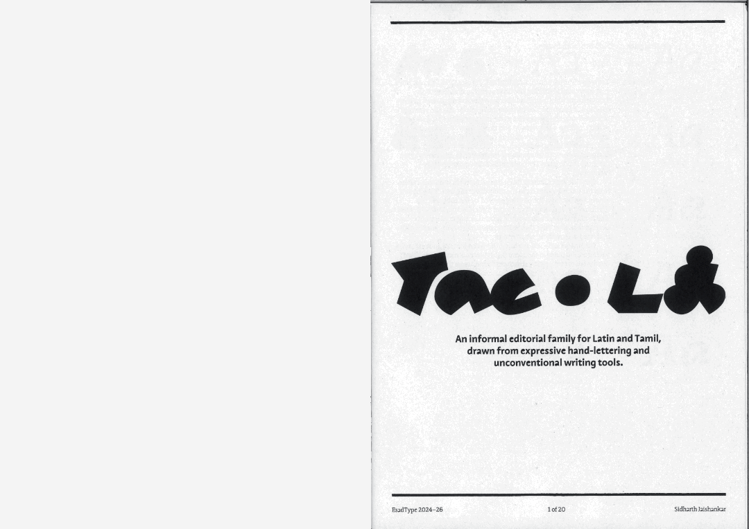
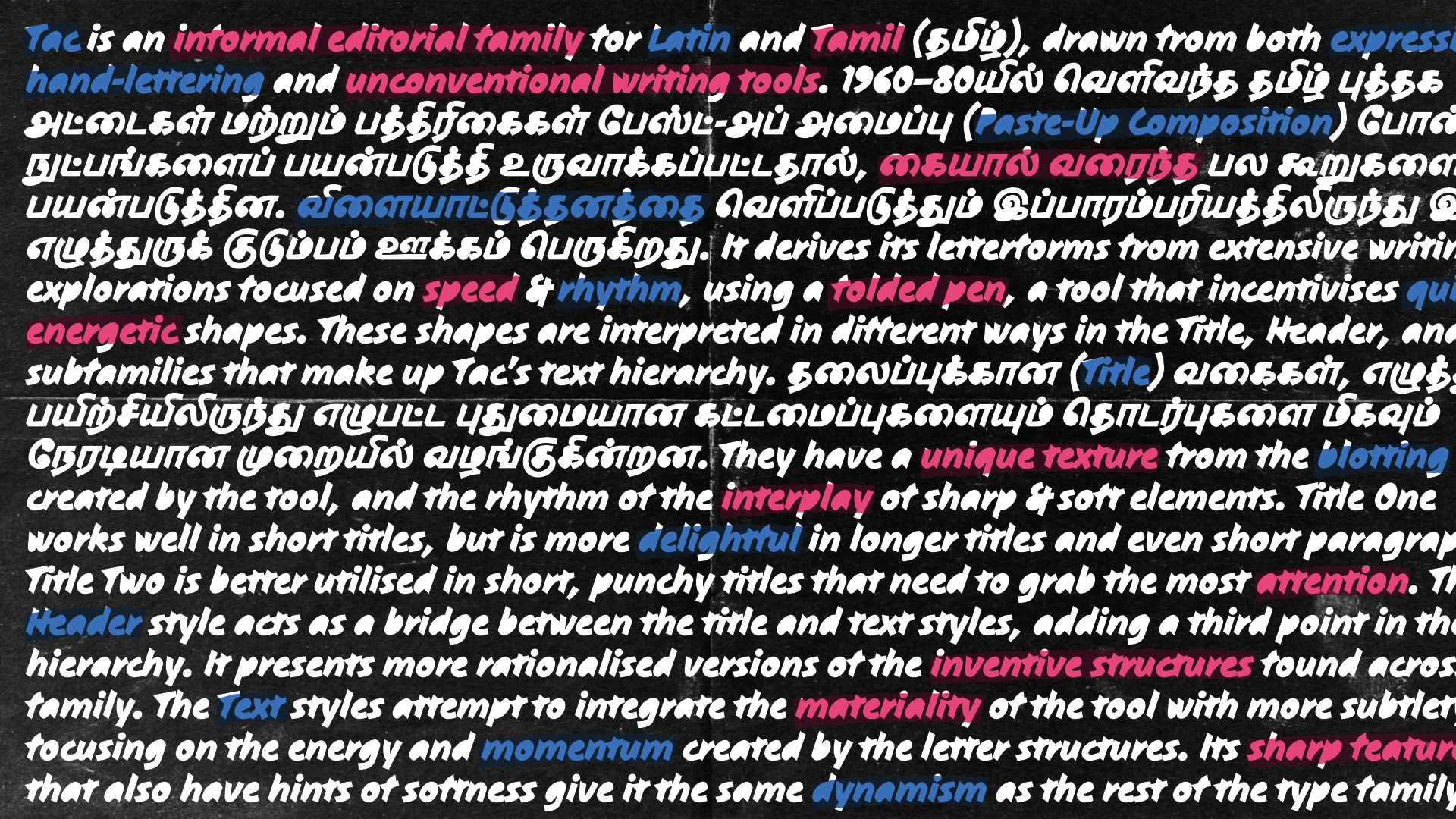
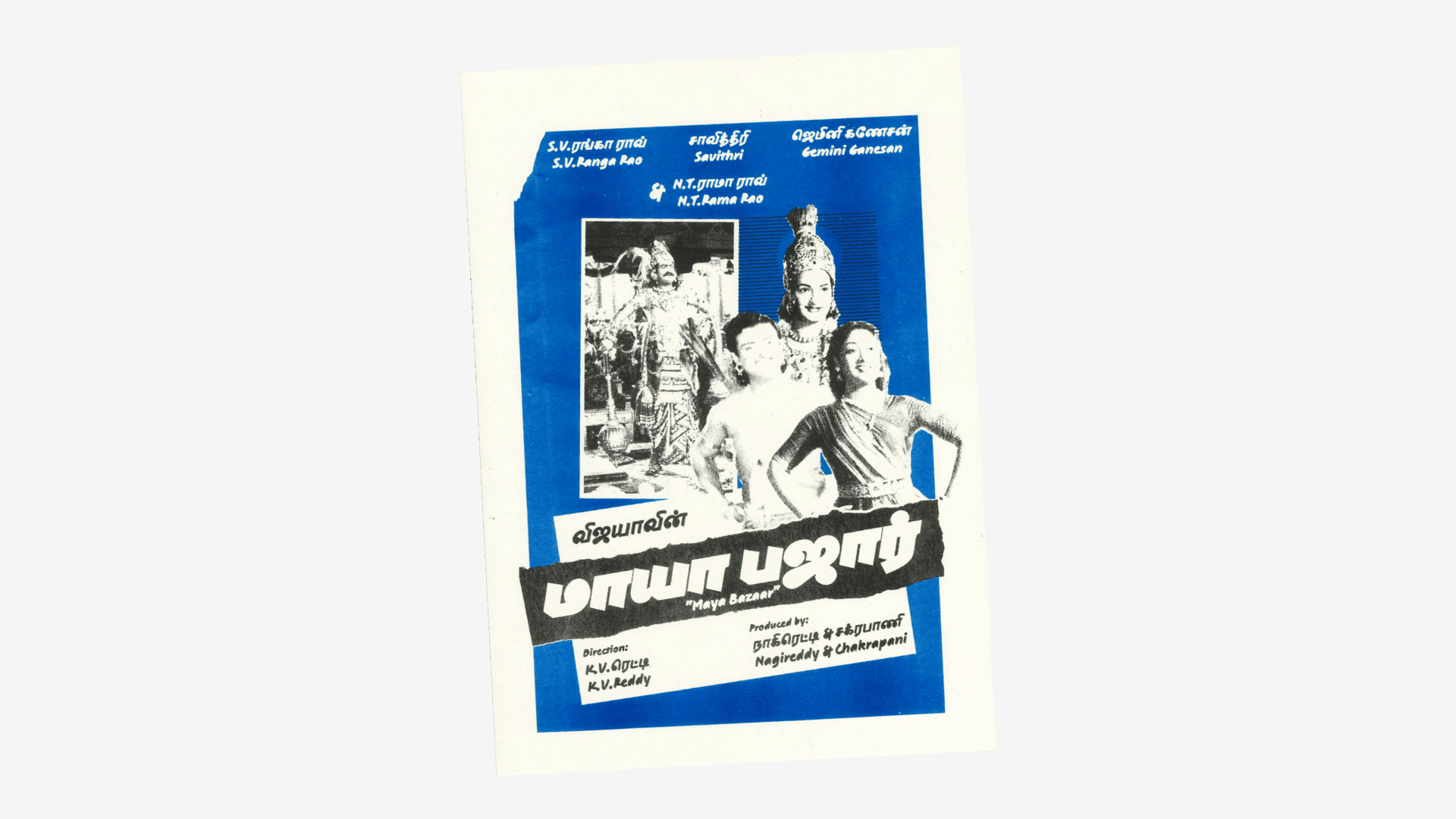
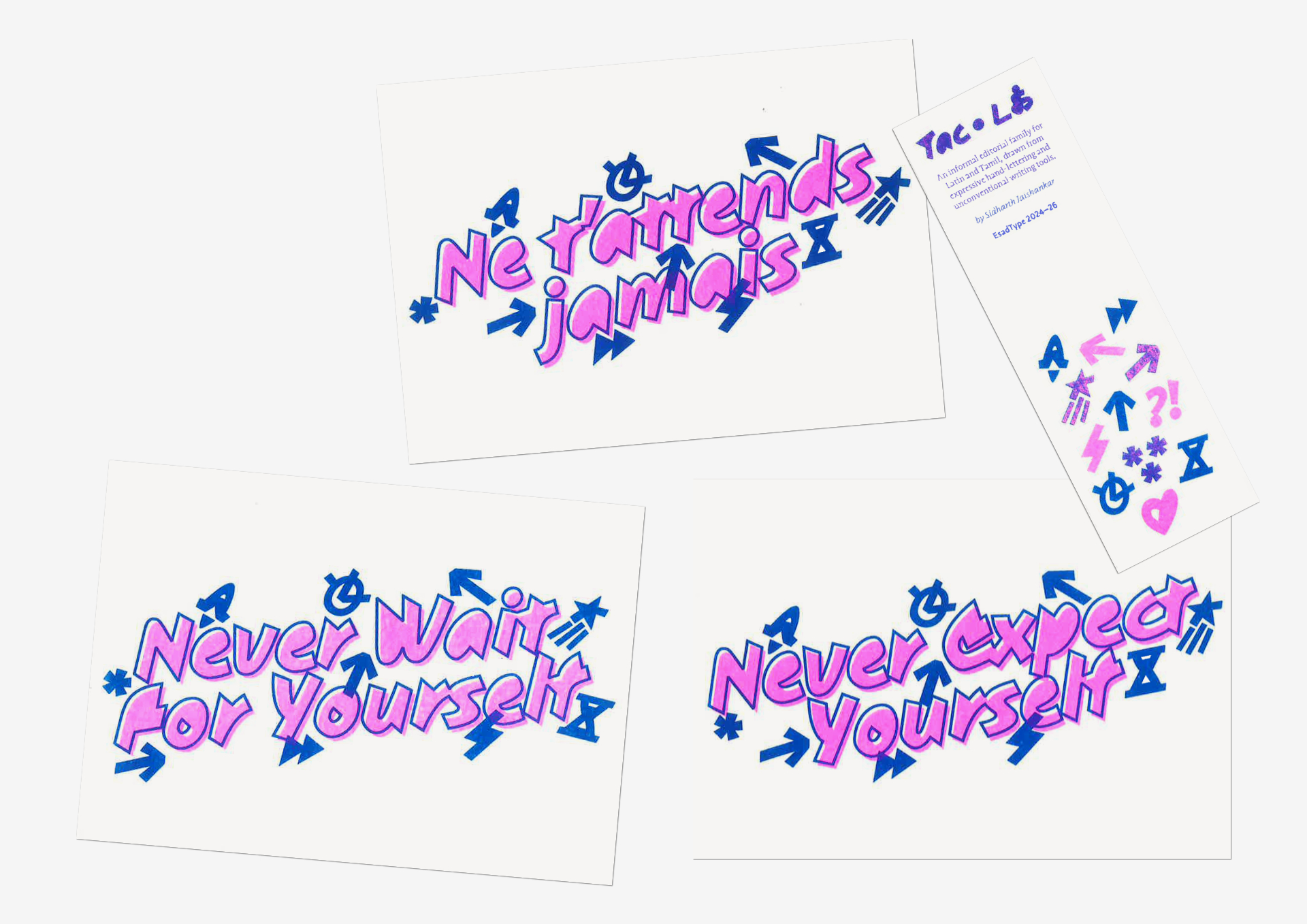
Tac is an informal editorial family for Latin and Tamil, drawn from expressive hand-lettering and unconventional writing tools. Taking inspiration from Tamil book covers and magazines in the 1960s–80s that used a lot of hand-drawn elements, and were put together using techniques like paste-up composition, it goes back to this tradition of playfulness and expressivity. It derives its letterforms from extensive writing explorations focused on speed and rhythm, using a folded pen, a tool that incentivises quick and energetic shapes. These shapes are interpreted in different ways in the Title, Header, and Text subfamilies that make up Tac’s hierarchy.
The Title styles present inventive structures and interactions from the writing exercises in the most direct manner. They have a unique texture from the blotting created by the tool, and the rhythm of the interplay of sharp and soft elements. Title One works well in short titles, but is more delightful in longer titles and even short paragraphs. Title Two is better utilised in short, punchy titles that need to grab the most attention.
The Header style acts as a bridge between the title and text styles, adding a third point in the hierarchy. It presents more rationalised versions of the interesting structures found across the family.
The Text styles integrate the materiality of the tool with more subtlety, focusing on the energy and momentum created by the letter structures. Its sharp features with hints of softness give it the same dynamism as the rest of the family.