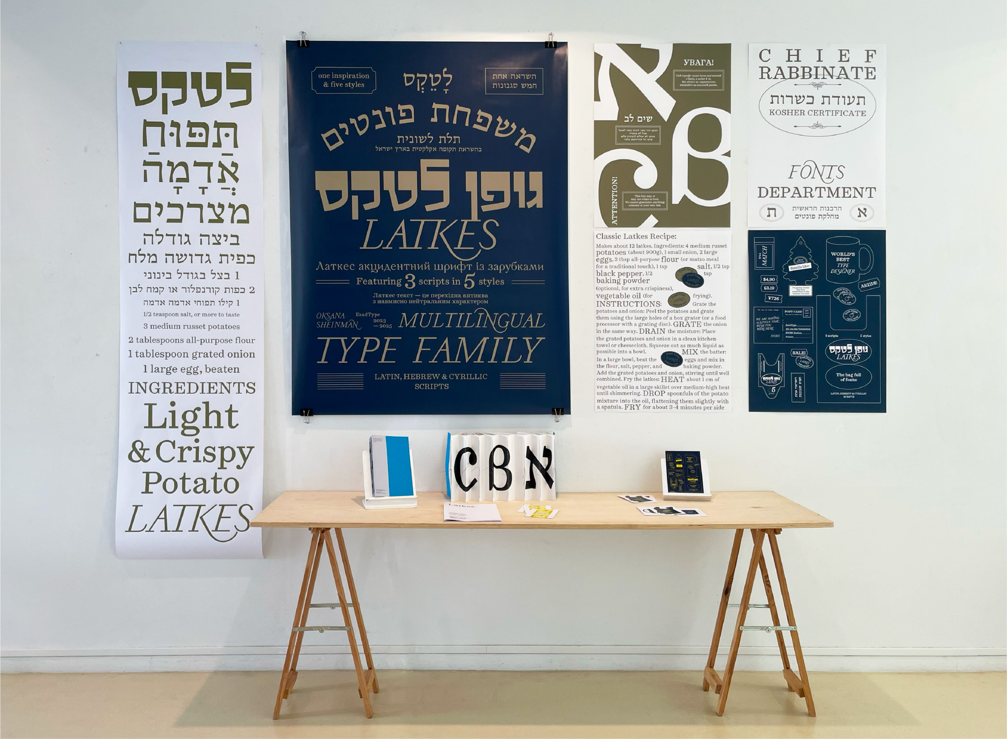
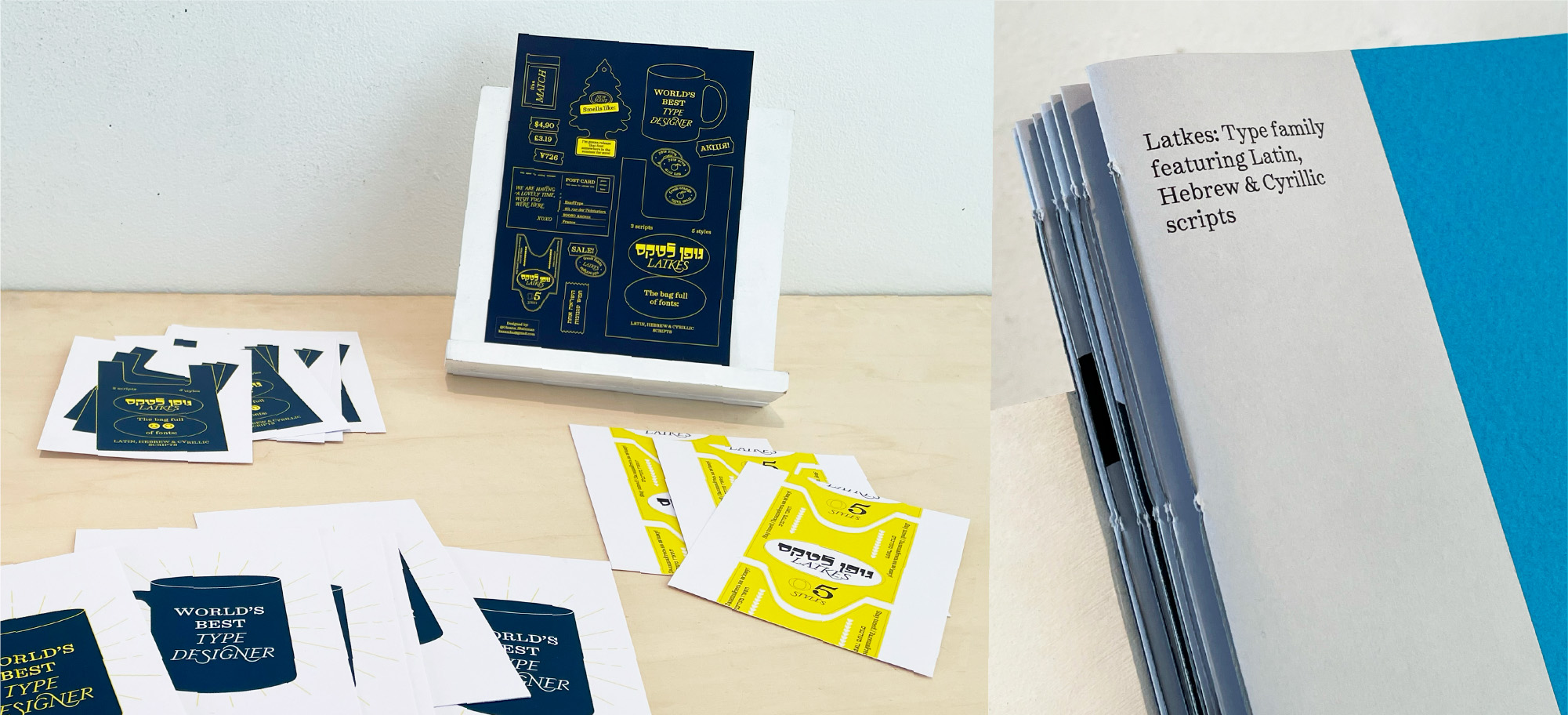
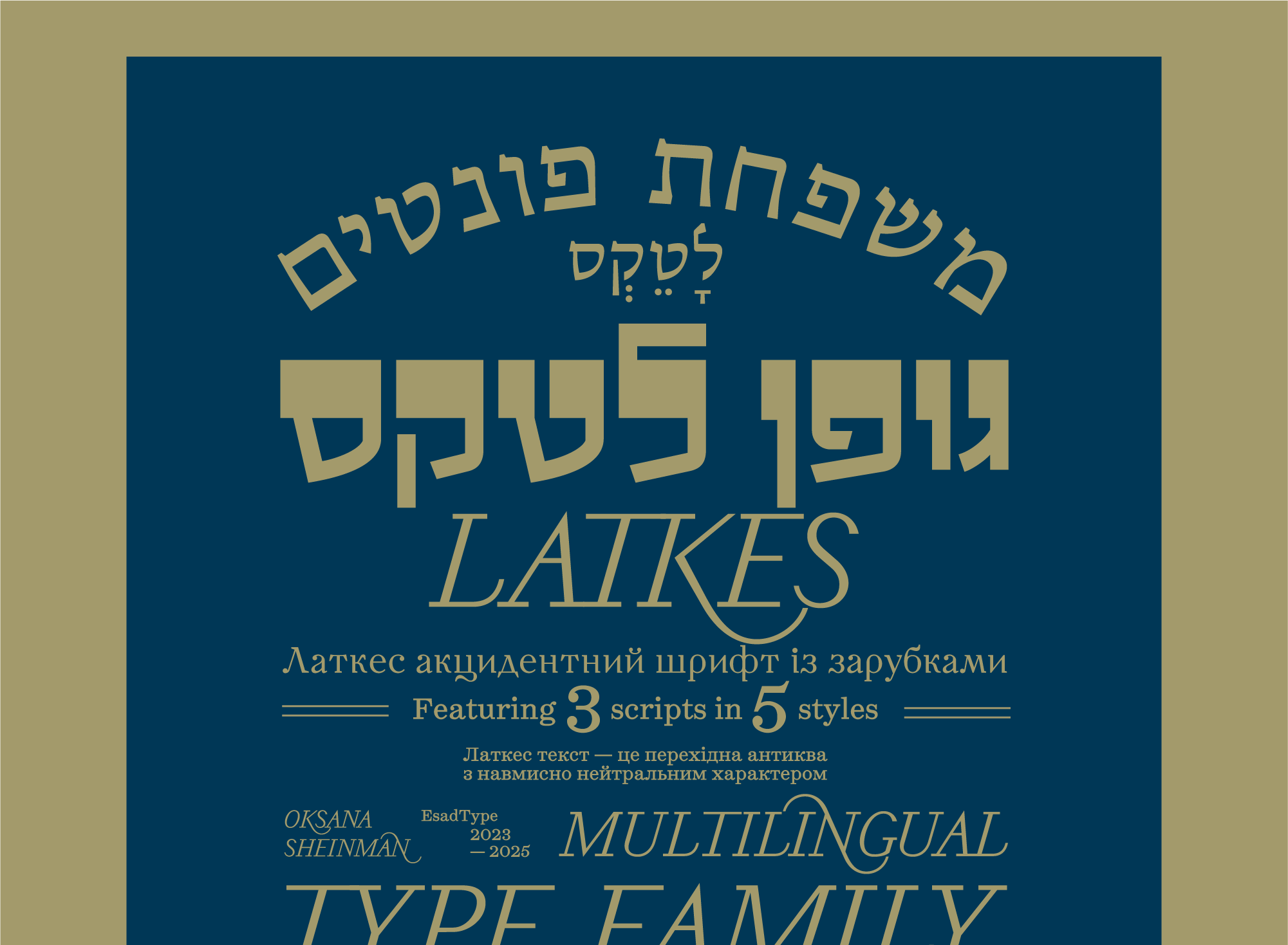
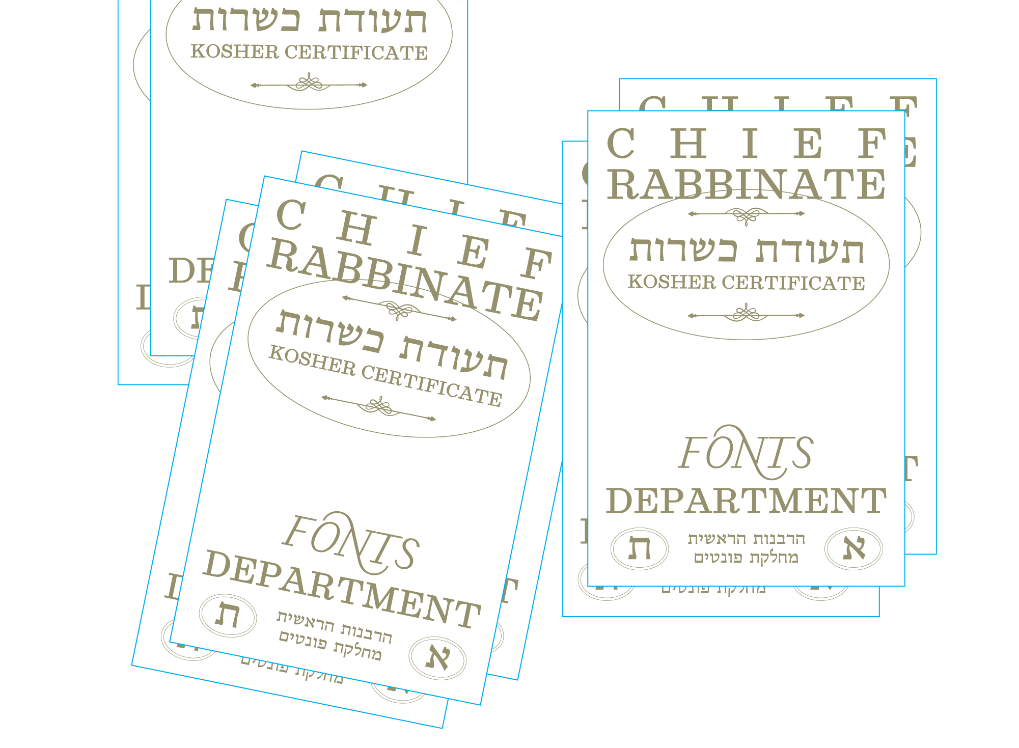
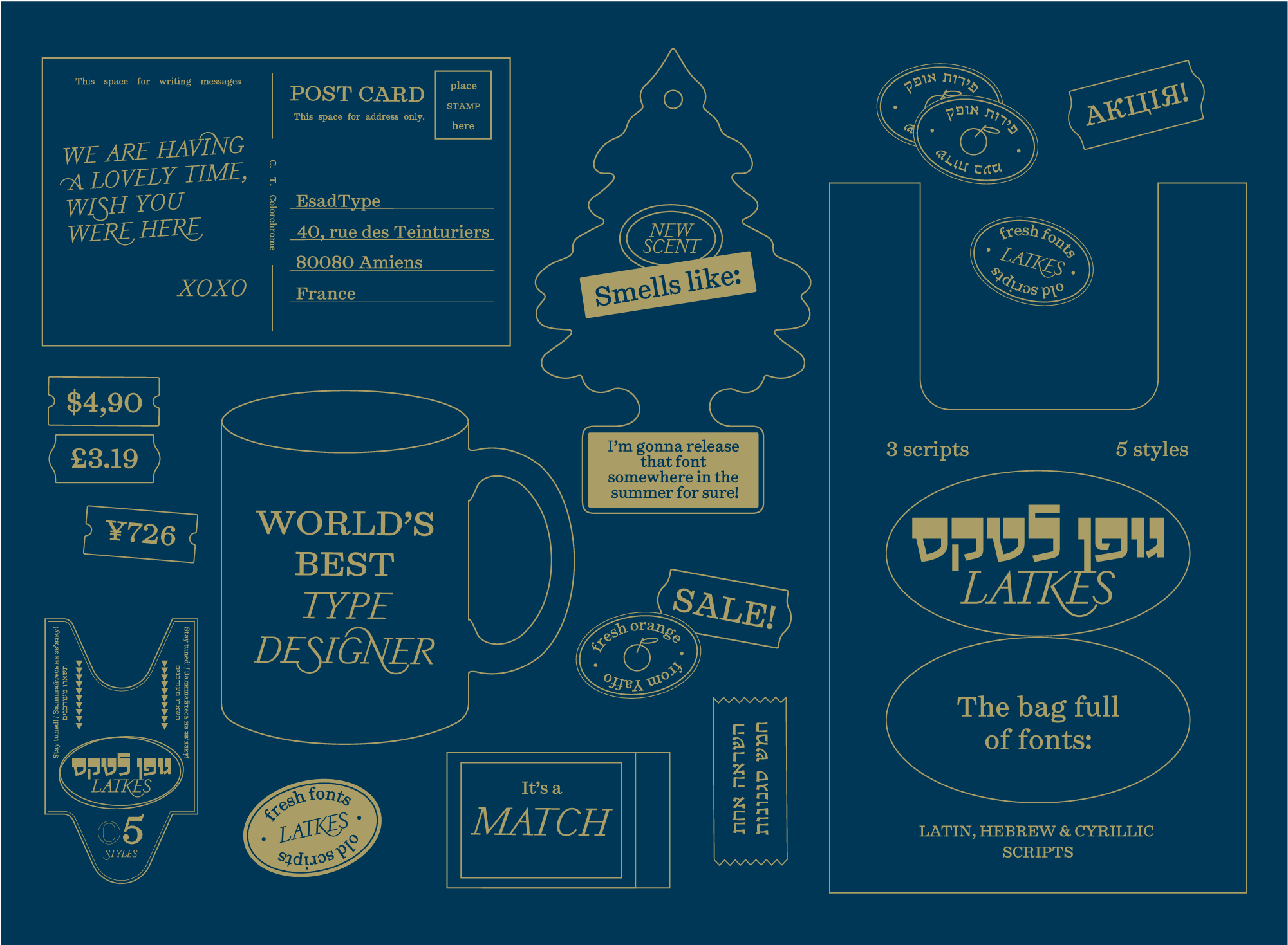
A Type Family Bridging Latin, Hebrew, and Cyrillic
The Latkes type family was designed to harmonize Hebrew, Latin, and Cyrillic scripts, creating a system where each script retains its identity while coexisting seamlessly. Rooted in historical research and typographic experimentation, it draws from diverse influences – Israeli shop signs, Ukrainian banknotes, and classic European type traditions – while adapting to contemporary needs. This approach enhances expressiveness while maintaining structural integrity.
The Latkes Hebrew Text design process has been shaped by experimentation with different mediums. The Latkes Hebrew Display emphasizes horizontal strokes over traditional vertical dominance, inspired by vintage signage and experimental calligraphy. The Latkes Latin Text are built on Scotch Roman base references, balancing classic high contrast with decorative flourishes influenced by flea market book discoveries. The Latkes Cyrillic Display references old Ukrainian banknotes (1917–1918), reinterpreting bold, ornamental details into a modern typographic voice, while the Latkes Cyrillic Text takes inspiration from the Soviet-era Century Schoolbook, known for its readable, warm character.
This type family is carefully designed to maintain the distinct rhythm and proportion based on the geometrical parameters in each script while allowing them to function together as a unified system. The contrast between styles – such as the expressive, bold character of the Display versions and the refined, highly readable Text styles – creates a dynamic typographic palette that can be adapted for different design contexts.
Designed for multilingual branding, editorial, and cultural projects, the type family embraces the contrasts and connections between scripts. It is a versatile tool for designers navigating linguistic and cultural intersections, preserving tradition while pushing type design forward. Whether used for expressive display settings or refined body text, it bridges historical influences with contemporary functionality, celebrating the rich typographic heritage of each script while creating something new.