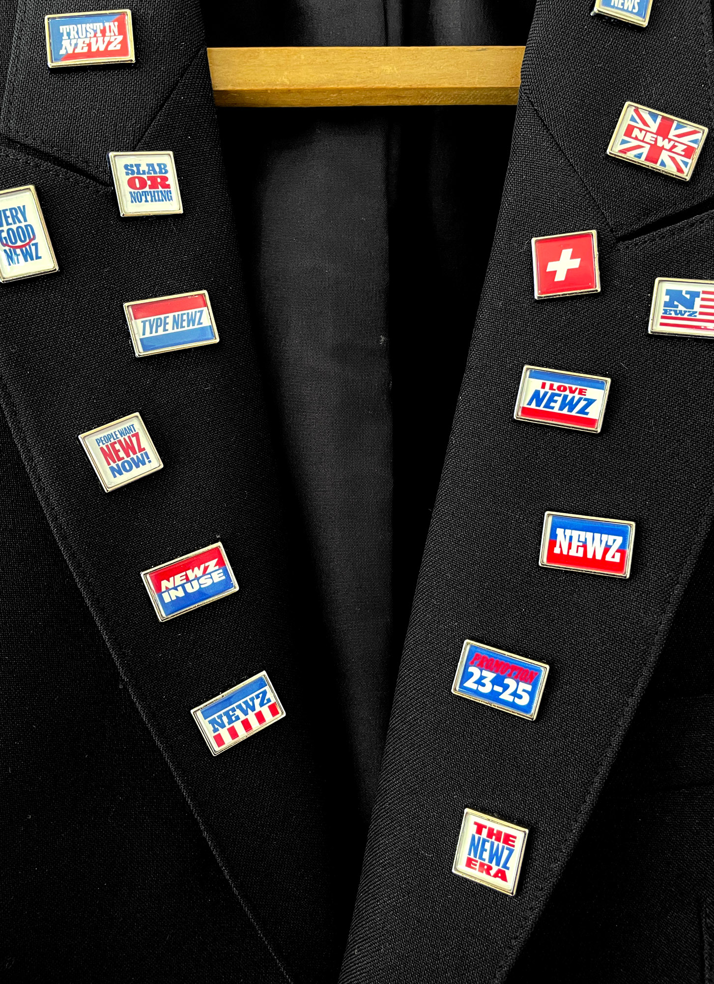
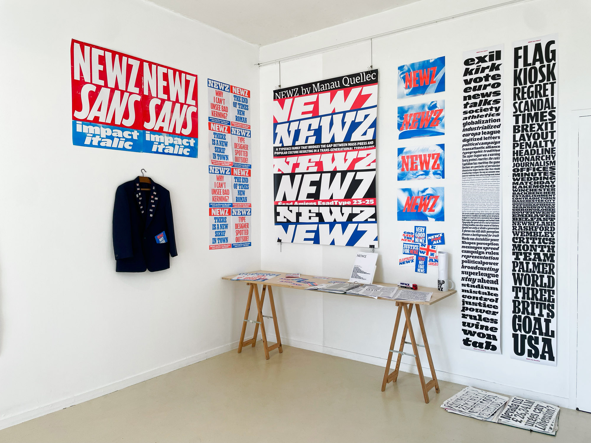
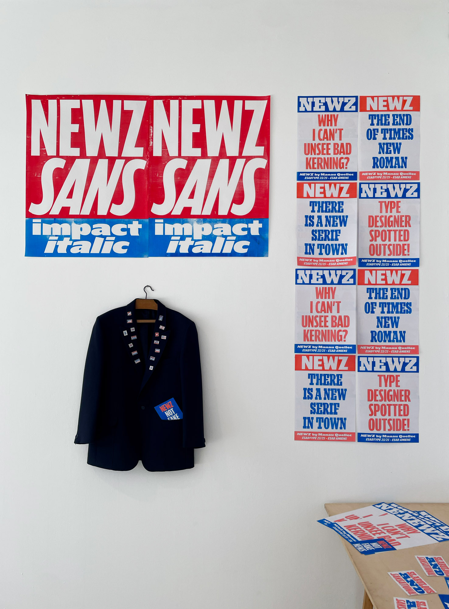
A typeface family that bridges the gap between mass press and popular culture, resulting in a trans-generational typography.
Newz is a typeface forged at the intersection of historical print traditions and contemporary visual culture. It draws a direct lineage from the typographic canons of the 18th-century English press, where the rise of industrial printing stimulated the bold, authoritative letterforms of Figgins and Thorowgood, while absorbing the aesthetics of late 20th and early 21st-century mass media. Somewhere between Fast & Furious and English tabloid billboards, its design is an exploration of impact, slant, and spatial tension, shaped by the way headlines have commanded attention across centuries.
These dual influences manifest in Newz’s two primary display styles. The Slab Headline version inherits the dense, weighty authority of early newspaper typography, where serifs were engineered for clarity and presence in an industrialized press. The Sans Impact version, in contrast, is steeped in the visual codes of contemporary mass communication; drawing from the condensed, high-energy lettering of sports magazines, 1990s and 2000s action movie posters, and video game covers, where aggressive slants and tight spacing amplify dynamism. Despite these contrasting origins, the typeface is tied together by a cursive logic that runs through both styles, not as a decorative flourish, but as a structuring principle. The inclination, fluidity, and movement inherent to cursiveness inform both the letterforms and their spatial relationships, creating a sense of urgency and rhythm that transcends the rigid boundaries between slab and sans. This approach directly shapes the space design of the typeface: structuring the rhythm of white space, optimizing balance, and reinforcing the kinetic energy that defines both styles. Over time, these influences have blended into one another: the Slab Headline absorbs some of the expressive flow of popular visual culture, while the Sans Impact is anchored by the structural discipline of print heritage.
Though already functional as a display typeface, Newz remains an evolving project. Future developments will include a text-caption sans serif specifically optimized for smaller sizes, alongside expanded width variations derived from the Slab Text version. These additions, ranging from ultra-bold to thin weights, as well as monospaced adaptations, will ensure greater versatility, allowing the typeface to function seamlessly across a broader spectrum of editorial and digital applications. More than a static revival, Newz positions itself as an ongoing reflection on how typography mediates the language of urgency, adapting to both historical and contemporary rhythms of mass communication.